[05] DE NATA
Brand Design | Packaging
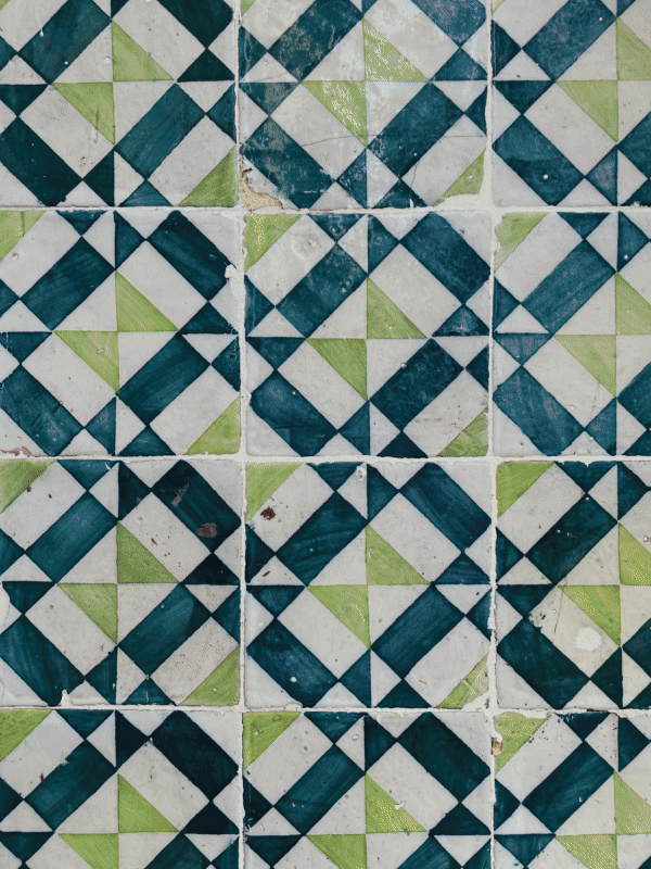
Branding for the "first Pastel de nata in Israel" The branding draws inspiration from colorful Lisbon, and from the tiles that characterize it so much. The pastel character I created, and the whole language is fun and young, adapted to Tel Aviv's customers, as well as the name I chose - de nata, which reminds the phrase de nada which means in Portuguese - you’re welcome.
[Branding, BELAS ARTES Lisbon, 2023]


packaging
Pastel’s de nata are often sold packed tightly together, one on top of another. As a customer, I wanted a more thoughtful experience, one that gives each tart the space and attention it deserves.
This led to a modular packaging system designed for one, three, or six tarts, offering both protection and visual presence. The boxes stack neatly in-store, creating a colorful, eye-catching display that enhances both practicality and brand impact.


